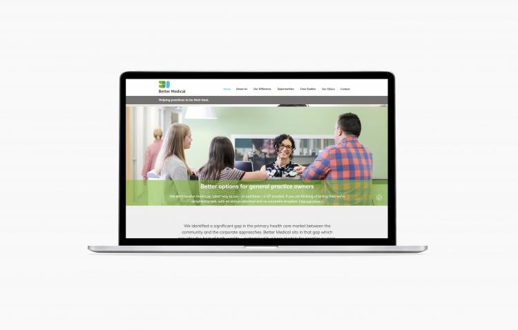
Better Medical was created out of a shared vision that there is a better way to deliver and sustain high-quality primary health care. As a part of that vision, a new logo. branding and website was required to reflect this.
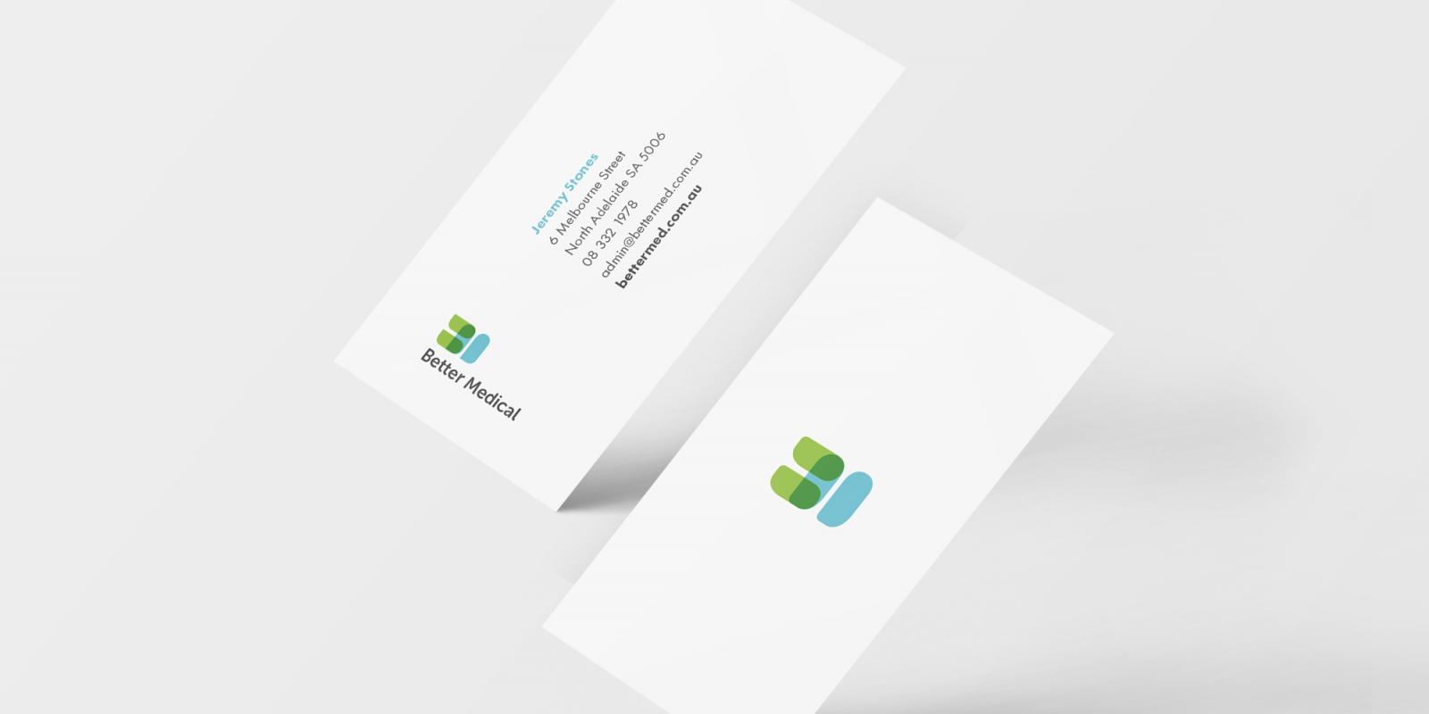
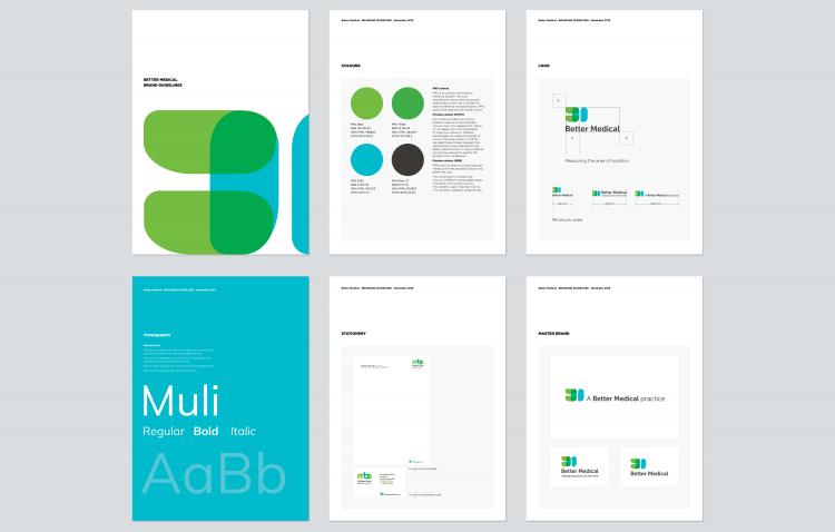
In the new identity, the letters B and M interlock to represent the relationship between Better Medical and their clinics. The overlocking element is transparent that conveys that Better Medical is open and committed to partnering with their GP clinics.
The traditional healthcare colors of blue and green have been reinterpreted in modern hues accompanied by Muli, a san serif font that portrays professionalism and warmth.
Since the branding launch, Better Medical has grown steadily year-on-year and is now comprised of 90 general practice clinics in South Australia, Queensland, Tasmania, and Victoria.